Where I last left off, I mentioned that I was going to try the necessities set again to see if I would have any of the same issues I had with the fundamental pencils.
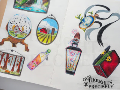
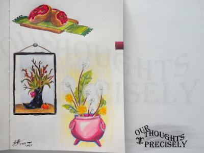
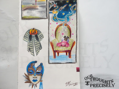
I tried another picture using the Necessities set using similar colors, facial features, and shadows to see if there would be a difference in how I felt about them. While this set doesn’t blend as well as the Prismacolor colored pencils, it does layer better than the Fundamentals. I was able to build my layers and deepen the shadows. I did have to work with them and preserve as much of my white-space on the page as possible—because the white pencil doesn’t do anything (I feel like this is becoming a bit of a theme)—that being said, they had a better color payout overall.
If I put the two images side by side, there are noticeable differences, especially when viewed in person. The one made with the Fundamentals set (on the right) looks flatter and the other (on the left) has more depth and a cleaner look overall.
To make the comparison’s a little clearer, here are some swatches. Looks like three shades of orange right? Well, the differences aren’t so easy to spot when they’re lined up side by side. However, when I did a quick blend test with orange, red, and pink of comparable shades, the differences become a little more obvious. The Prismacolor’s blend together with ease and I got a smoother transition between the three colors. The Necessities set all the way down at the bottom, did blend together. While the Fundamentals set didn’t have as bright a red, and when it came time to blend, it did so a little but on close inspection the transitions weren’t as smooth as they could be.
There are pros and cons to every set, but my final thoughts are that the Prismacolor Premier pencils—while a little pricey—are worth the cost because they fit well with what I mostly do. They blend easily, the colors are vibrant, and I can layer without feeling like I have to fight the pencils to get where I want to go. For my sketchbook, I’ll use the Necessities set, because I have them. They’re not bad. However, when looking at the prices of some of the other Artist’s Loft colored pencil sets online, if I’m going to spend $36, I’ll probably just go with Prismacolor. My thoughts about the the Fundamentals set hasn’t really changed. As such, I’ll still keep them, but they’re going to be reserved to very light uses.


