Showing posts with label art. Show all posts

Friday, October 12, 2018

The Witch 2018 Repaint...

At the beginning of the month, I mentioned that I wanted to get back into making art related posts again. So, one of the things I wanted to do this October was redo some of the art I posted around this time last year. And the one that stood out to me first was the witch watercolor painting I did. I know I can do better now, and that’s the main reason why I wanted to tackle this project. Before I get into the process behind my updated version of this painting, I want to show the old one for comparison.

It’s not bad, but I can see all the places I went wrong on this painting. My layers were too dark too soon, and the colored pencils didn’t blend well at all unlike the Prismacolor ones I’m currently using.

The process…

Going into this project, I knew I wanted to take my time before I put paint to paper. I usually do some planning, but for this one I did more sketches before making a decision on which direction I wanted to go. I’ve been trying to change my process for more detailed pieces. So, I started out by looking at the original version + the old sketches and determining what I liked about them. From there, I made some new sketches for it while keeping in mind that I wanted to keep some of the key features including: the hat, the dress, and the two-tone hair. Once I was happy with the overall look, I started playing around with some of the other aspects of the sketch such as: the hat, and if I wanted to change the position of the arm and add a bird or not. However, I ended up scrapping the latter idea because I wanted to maintain some of the simplicity found in the original. I’d also decided to stick with watercolor and colored pencil instead of using a different medium like digital or acrylic paint.

Once I’d figured everything out, next was my favorite part: the actual painting part of the whole process. I enjoyed this part a lot. I had a loose idea of the colors I wanted to use, and in the end, I didn’t end up using as many darker tones as I thought I would. The purples, blues, oranges, pinks, and reds looked better when side by side with the other painting I’m going to be talking about later this month. After I was fine with where the color was at, I finished the painting off with colored pencil, bronze Sharpie, and little hints of white gel pen….

The finished painting…


Here’s a closer look at it....


Up next, I’m going to be talking about a different painting I worked on that I’ve nicknamed the Spider Bride….


Supply List...

Sakura Koi Watercolors 
Prismacolor Premier Colored Pencils 
Artist Loft Level 2 140lb watercolor paper 
Bronze Metallic Sharpie 
Gelly Roll white gel pen


Wednesday, October 3, 2018

Quarterly Recap: July-September

It’s time for another Quarterly Recap. I’m going to skip a long intro and jump right into reviews for July, August, and September....
July Reviews:


August Reviews:


September Reviews:


Note: weekly meme labels (Music Monday & The Friday 56 + Book Beginnings) can be found on the Extras page.

Other July Posts:


Other August Posts:

Other September Posts:
I want to do more art/random type posts again. I kept up with them in July and August. However, for the past month, I’ve experienced some creative burnout and couldn’t figure out what I wanted to write or read for a few weeks—and the things I did create were ones I didn’t want to share on the blog. Luckily, October is one of my favorite months, and I have a couple of different posts planned. And if all goes well, they should appear sometime this month or in November.

Upcoming posts that are already scheduled....

On Friday, I’m going to post my thoughts about Spinning Silver by Naomi Novik. Later, I have reviews for Mem by Bethany C. Morrow and The Proposal by Jasmine Guillory. I also have a spotlight post coming up that I’m excited to share.


Thursday, August 2, 2018

Watercolor: Places #3

Comments: This is the third watercolor painting I worked on, and I wanted to try something a little different from the others. It came out how I wanted it to—particularly the background behind the city. However, I almost wish I’d reversed the colors and made the sky darker while reserving the lighter shades for the city itself. It’s too late to go back and change it for this one, but I may incorporate the idea into a different painting....


Sunday, July 15, 2018

Sketchbook...


The more I work in my sketchbook the more I’ve thought about the ways I’m currently using it. And I realized that I haven’t blogged about my process, shared any pictures of my favorite pages, or anything like that. It’s mainly due to the fact that I’ve spent more time creating art and haven’t stopped to consider if it would make a good blog post, instagram picture, or some other kind of content. I’ve essentially been enjoying the process and learning as much as I can from it. In my sketchbook, I can be as messy or composition-conscious as I want to be. It doesn’t have to be one or the other, because it’s my sketchbook.

What I’m saying is that I use my sketchbook to experiment. I bounce around between realism and cartoonish styles, even going as far as to combine elements that I like if it seems right for whatever I'm working on. I have a lot of pages that are unfinished, some dedicated to pose/anatomy practice; concepts for watercolor, acrylic, or digital paintings; and random bits and pieces of landscape and buildings. I’ve tried out a few different things that I might otherwise have never gotten around to because I didn’t want to spend the time doing them digitally. Ironically enough, this whole discovery process involved a box of crayons.

While organizing my room I found an old box of ordinary Crayloa Crayons—the basic 24 color set—in a bin of art supplies I haven’t looked at in years. Crayons, just like ballpoint pens, are another art supply that I like to sketch with. It challenges me since I can’t go back and erase all of the lines I just made. So, even if there’s something I don’t like, I’ll have to incorporate it into the sketch anyway. Also, it’s a lot of fun to work with all the different colors. Having more options encourages me to take more risks. After a while, I wasn’t satisfied with just the basic 24 set. I wanted more. And the great thing about crayons is that they’re cheap, like, really cheap. I bought a 120 count set for about 6-7 dollars from Michaels with a coupon, because drawing with crayon is
so

much


fun....


And I can save my more expensive supplies.

So, my sketchbook is just that: my sketchbook. There doesn’t need to be any stress. There doesn’t need to be any pressure to create content for the blog or twitter or anywhere else. I may share some more pages, or I might not. I’m just going to make art.

What are your thoughts on sketchbooks? Do you have one? Are you planning to start one?


Friday, July 13, 2018

Watercolor: Places #1

Comments: Lately, I’ve been trying to reduce the amount of fuss I go through while preparing to start another a painting. That means no tape at the edges, perfect lines, or overthinking. I’ve essentially been adding color to sketches without worrying if my pencil lines show through, and it’s been a lot of fun. I’m getting more done, and I’m generally happy with the results. One of the pieces I worked on was this street. I liked the shape of the structures and the simplicity. I was also experimenting with colors, which is something I need to do more often....


Sunday, July 1, 2018

I Made A Sketchbook...

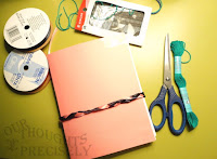
In my mid-year resolution check-in post, I mentioned that I wanted to get a smaller sketchbook so my goal of finishing one was more manageable. In the end, I chose to make a sketchbook since I wanted to try out a different technique of binding the signatures together instead of using staples. There are a number of good tutorials on youtube, but the best ones I found were Following the White Rabbit DIY journal/sketchbook tutorial series that you can find HERE. The steps were straightforward, and the visual/ real-time tutorial made it easier to pick up on what had to go where and when. . . .

Supplies I used...
  • Hand sewing needle
  • Scissors
  • Turquoise blue/green embroidery floss
  • Pink Card stock
  • Regular old tape
  • Ribbon (black and pink)
  • Artist’s Loft 70 sheet count drawing pad; 11 in x 14 in

I had a lot of fun with this project. It was easier than I thought it was going to be. What I mean by that is that I way overestimated the difficulty of it, because it’s not difficult at all. The paper I chose was just some sketch paper I had. Because of the size, I cut the sheets in half at the center before folding them three or four at time to create my signatures. The actual binding part took a little bit of
time to get used to, but once I did, it was mostly smooth sailing from there.

After my signatures were bound together, I moved on to constructing the cover. I thought “oh hey, I’m just going to do something simple,” which was followed by “this is going to be quick.” No. that’s not how it turned out, because I added a pocket and a ribbon (to tie it shut) at the back. The cover itself was easy to put together since it’s literally three pieces cut from a single sheet of card stock, which I taped together with tape I had lying around my house. Where it got complicated was the pocket and the ribbon tie. I decided to braid the ribbon after spending at least ten minutes deciding how I wanted the pocket to look. I’m not complaining about the time I spent on it, because I like the look of it. And the skills I learned during the process will come in handy when I attempt to make another sketchbook.

Overall, I was happy with the results. If I do this again, I’ll probably use different materials such as stronger tape—preferably something with a pattern—and I would replace the card stock with cardboard and a fabric overlay as a finish. Also, my binding wasn’t as tight as I wanted it to be and it may have had to do with the type of string I used. It was quite thin. So, next time around, I might look into getting a different type that’s a little stiffer, like twine.

Have you considered making a sketchbook or journal?

Monday, May 21, 2018

Acrylics #2: The Day

For my second foray into painting with acrylics, I decided to work on the sketch I mentioned in the last post—nicknamed the day. So just for reference, I’m going to show it again....

Overall, I’m happy with how this painting turned out. I was a more comfortable with the medium—I don’t even know why I was stressed out about it in the first place—which partly contributed to how much fun I had while working on it. One of the things I was most excited about was the color choices I’d picked for it.
Last time, I mentioned that I wanted a smoother transition between light and dark. I wanted the shadows to be deep, and the lightest spots to standout. And that meant adding more shades to bridge the gap between the light and dark extremes. I love how the colors turned out, particularly how the blues look against the rest of the painting. I don't know about anyone else, but I like working with blues because its a color that's easy to match with others. I love the coolness of lighter shades as well as the richness of darker ones. I also made a few minor tweaks to the sketch, and while the focus remained squarely on the face, this time around I wanted more detail. With the night, the headband was just a kind of, well, random lines that I added as sort of an afterthought. For the day, I wanted the veil/headpiece/clothes to have a specific look where the details were vague enough to fit my preference, but precise enough for them to be immediately recognizable

Acrylic is a pretty forgiving medium. Unlike watercolor, it's easy to go back and make little tweaks without having to choose a different medium—like colored pencil, gouache, gel pin, ink, etc.— to make corrections. However, my biggest takeaway from this is that I’ve learned more about my own process, and some of the immediate changes I made were focused on how I approached the painting at the start. For the night, I worked from the center before moving out to the edges. That worked out okay, but when I paint using traditional mediums, I noticed that I prefer my first layer to start from the background before then working my way in, leaving finer/finishing details for last. While working on the day, I kept that in mind and found that I wasn't frustrated with the progress with this piece as I added more and more to it. 

It's easier to see what I'm talking about when the two paintings are shown together. So for comparison purposes, here they are side by side. Going forward, I have a couple more projects in mind. I won’t mention the exact details yet, because I don’t have any sketches prepared and my plans aren’t set in stone. That being said, I look forward to using acrylic paint again....

Have you used acrylic paint before? If so, what do you like or dislike about it? If not, would you try it?

Tuesday, December 19, 2017

WIP December #4: New Paint + Another House

WIP: I've returned to drawing houses.


Comments: The simplest explanation behind this painting is that I got some new art supplies that I needed to get comfortable with. I haven’t done a proper review for them and figured that I might as well go ahead and talk about them, since I will be using them regularly. The first item is a new set of colored pencils: Prismacolor Premier. Second, Michaels had a 60% off coupon on the Saturday after Black Friday, and I got new watercolor paint: Sakura Koi Pocket Field Sketch Box. I have used products by Sakura before—including the white gel pens and the fine liners—and have wanted to try this set of watercolors for a long time.

Sakura Koi is very different from Reeves Watercolor. The colors are vibrant, and I disn't feel like I had to try as hard to achieve the shades I wanted. The finish is smooth. It’s not chalky once it’s dry, which is what I was expecting since this paint is a little more expensive than Reeves. I also love the colors, and I'm especially a fan of the olive green. I’ve tried to mix paint to get that shade before, and it’s never been exactly what I’ve wanted. So, having the shade already there—no mixing required—makes me absurdly happy because I know that I’m going to get a lot of use out of it.

This painting was more of an experiment than some of the other pieces of art I’ve talked about on the blog. So, I also wanted to see how white gel pen and my new set of Prismacolor Premier colored pencils would look on top of the paint. Due to the colors I was using, you can’t really see the colored pencils. That being said, the white does standout.
____________________________________________________________________________

Thursday, December 14, 2017

WIP December #3: Faces

WIP: Faces.

Comments: I’m halfway through this series of posts and have decided to temporarily switch gears and work on some faces, because facial features are one of the things I need to work on. So, here are two pages from my sketchbook.

I’m trying to challenge myself so I don’t fall into the habit of being too comfortable with a limited set of features, because I don’t want all the characters I draw to look the same. It’s something I tend to keep in mind, particularly when I’m going the digital route. With traditional mediums, I'm more conscious of this.

As I finished the first page, I realized I just wasn't done with this yet.  What should have been a quick drawing exercise ended up creeping onto the next page. Once I fell down that rabbit hole, I ended up finding  too many unique faces that I wanted to sketch. I just kept going when I knew I should have moved on to something else, but I was on a roll. And then there's that one lone doodle. It looks so out of place next to the other faces on the page, and more than once, I wanted to add more and more detail to it. It also didn’t help that I was working on the same two pages across multiple days and had to remind myself that it was just doodle.
____________________________________________________________________________

Are you working on anything interesting?

Tuesday, December 12, 2017

WIP December #2: Houses

WIP: Houses.


Comments: At this point, I have committed to drawing a few buildings before moving on to something else. Around the time I started working on this post, I watched Minnie Small’s video on how she draws buildings—she has a lot of good advice, and I highly recommend checking out her channel if you have the time. You can check out the video HERE. I was inspired by it, and decided to just take the plunge and draw buildings without overthinking the process. I had a lot of fun just playing around with pencil. I originally thought that I might try to also work on my lines with Fine Liners—or even colored pencil—but it didn’t work out that way. As I moved from one sketch to the next, I quickly discovered that I liked the look of it as is, which prompted me to leave them in pencil. Also, apparently I'm a fan of houses with panel exteriors. It was something I notice when I was looking for references. I was drawn to houses with interesting architectural details and exteriors—particularly wood and vinyl sidings.

Story time: I used to live in a house that had a combination of red brick and vinyl on the exterior. I remember a couple of occasions when the wind actually damaged and tore down the vinyl. I can't remember how many times that happened, but I'm sure that it was more than twice.
____________________________________________________________________________
Related Posts Plugin for WordPress, Blogger...