Showing posts with label art. Show all posts

Friday, August 14, 2020

Acrylics...


Comments: It’s been a few months since I last picked up a brush with the intention of painting with acrylic paint. Recently, I was looking to improve on my use of lighting, so I painted this teapot. Acrylic is still one of my favorite mediums to use, because I prefer water soluble paints—like watercolor. For this one, I didn’t use a reference, because I wanted to see what I could do from memory. Arguably, my favorite part I worked on were the two random cherries at the bottom of the teapot. I like how they turned out, and I’ve thought about doing another painting of cherries or some other food related subjects. I have a few older photographs that immediately come to mind including a rough pastry I made years ago, as well as bacon. This piece taught me a lot and I hope to do more paintings like it in the near future.

What have you been working on lately?

Wednesday, May 27, 2020

Sketchbook: Watercolor...


Comments: Like most people, I currently have more time on my hands. So I did a couple of random watercolor sketches in one of my smaller unfinished sketchbooks. The reference photos I used were ones I took of the faux plants around my house. My use of watercolor (Sakura Koi) here was mainly to block in the general shapes before I went in with colored pencil....


Friday, April 17, 2020

Sketchbook: Alice (featuring The Nightmare-Verse by L.L. McKinney)


Comments: It’s been quite some time since I did something art related on the blog. As it so happens, I completely overlooked Our Thoughts Precisely’s blogiversary two years in a row, and so I decided to celebrate—belatedly—by sitting down and tackling one of the art projects that’s been on my mind for some time. I hardly ever draw fan art these days, but I’ve always wanted to make something inspired by Alice in Wonderland. I got a big dose of inspiration after I read A Dream So Dark by L.L. McKinney. I took my inspiration from various elements within the series instead of any one specific scene (so you don’t have to worry about spoilers). Some of my initial ideas were too cutesy for what I wanted. When my main goal was to capture more of the creepy-horror-action-aspect (the nightmares, the sword and daggers from the book covers), which are pivotal parts of the series. 

Materials for this project…
  • Ucreate 75lb, acid-free, lignin-free drawing paper
  • Artist’s Loft Necessities colored pencils in the color Light Orange
  • Art Minds Permanent Marker

What are you working on this week?


Thursday, October 31, 2019

Happy Halloween + Pencil #3


Today is October 31st. So before I begin I just have to say Happy Halloween! I hope everyone has a great day.


The last pencil artwork I specifically worked on for October was this one. It was, of course, inspired by a cupcake, and I’m calling it Be Careful with the Cookie. In the earliest sketch, I was planning to do a pretty basic cupcake with sprinkles. However when I started playing around with the composition, I noticed that it was kind of plain—which was the same issue I initially had with Halloween in a bottle for $5.99—which wasn’t what I was going for since I wanted the eye to be drawn to the cupcake.
Ultimately I kept the bat-shaped sprinkles, although they’re very small, but I added a cookie to the very top, as well as curls of smoke rising from the eyes and forming a skull. I like this one much better that way. The rest of my process mainly dealt with deciding what the cookie should be shaped like, and if I should add any color to it (you can see some of my thought process in the sketches). Being prepared allowed me to streamline the actual drawing process. Be Careful with the Cookie ended up being one of my favorite pieces to work on.


Thursday, October 17, 2019

Pencil #2


The next picture I worked on was a flytrap in a flowerpot shaped like a skull. I couldnt think of a good name for it, so I guess it'll just be Flytrap In A Flowerpot Shaped Like A Skull. So it is what it is. As for the process for this one, it was pretty straight forward. My inspiration was mainly this air plant I have. It sits on the side of a faux skull. I had the thought “Well, I want a flowerpot shaped like this,” and the idea sort of developed from there. The final artwork doesn’t deviate much from the sketches I did for it. I’m happy with how it looks.


Thursday, October 10, 2019

Pencil #1:

When I first sat down to brainstorm about what I was going to do, art wise, in October, I already knew I wasn’t going to participate in Inktober. I wanted to work in pencil instead of ink, and I wanted to get them done before October. And that’s what I ultimately decided on. Note: I’m not posting these in order, so I know the dates on the pictures aren't in chronological order.


The first drawing I worked on is called Halloween in a Bottle for $5.99. The idea behind it is along the lines of being able to buy a little bit of Halloween that’s, of course, in a bottle. You can see some of the early sketches I did for it. There are some pretty big difference between where the idea began, and where it ended up. Originally, there was supposed to be a bow, but then I scrapped that idea in favor of the box. And the box went from being simple and clear to decorative.

What are you working on this October?


Friday, July 26, 2019

Watercolor: Return of the Puffins

It’s been a hot minute since I last talked about the art I was working on over here on the main blog. So, I wanted to do that today.

Lately, I’ve been drawing a lot in my sketchbook, and I haven’t worked on as many paintings as I did toward the beginning of the year. However, on the 5th of June, I went back through some of my older pieces—the ones I did when I was just getting back into watercolor painting— and I came across the page of birds (I believe I mentioned it sometime in 2017?). I was in the mood to paint something different—not a portrait or one of my usual landscapes. I really just wanted to paint a puffin again. So, on the 5th, I worked on this painting.

The composition is a little off. That's mainly because I picked a few random plants I wanted to include, and I unfortunately didn't pay as much attention to the placement. However, this was just a practice piece. If I did it again, I would give more attention to where I wanted the eye to be drawn and would tie the elements in so that it didn’t look so odd next to the puffin. However, I did this for the process, and I accomplished what I set out to do. So, I’m happy with it. (Here's a closeup.)

Now, as far as Mermay...well, I thought about participating this year. However, I didn’t do as many individual pieces as I would have liked. I did a couple of marker sketches (not shown here), but the only completed ones are both in pencil. And the one in the corner is just a landscape I scribbled in because I had a sudden idea for it. However, after that, I got bored with the subject and went on to work on other things. It's a reoccurring theme on my end, which is often why I don't participate in month-long challenges. Since, I don’t have that much to show for Mermay, I thought I would share them here instead of on an individual post…

What have you been working on lately? Did you participate in Mermay?


Monday, March 4, 2019

Exploring Colored Pencils Part #2

Where I last left off, I mentioned that I was going to try the necessities set again to see if I would have any of the same issues I had with the fundamental pencils.


I tried another picture using the Necessities set using similar colors, facial features, and shadows to see if there would be a difference in how I felt about them. While this set doesn’t blend as well as the Prismacolor colored pencils, it does layer better than the Fundamentals. I was able to build my layers and deepen the shadows. I did have to work with them and preserve as much of my white-space on the page as possible—because the white pencil doesn’t do anything (I feel like this is becoming a bit of a theme)—that being said, they had a better color payout overall.

If I put the two images side by side, there are noticeable differences, especially when viewed in person. The one made with the Fundamentals set (on the right) looks flatter and the other (on the left) has more depth and a cleaner look overall.


To make the comparison’s a little clearer, here are some swatches. Looks like three shades of orange right? Well, the differences aren’t so easy to spot when they’re lined up side by side. However, when I did a quick blend test with orange, red, and pink of comparable shades, the differences become a little more obvious. The Prismacolor’s blend together with ease and I got a smoother transition between the three colors. The Necessities set all the way down at the bottom, did blend together. While the Fundamentals set didn’t have as bright a red, and when it came time to blend, it did so a little but on close inspection the transitions weren’t as smooth as they could be.

There are pros and cons to every set, but my final thoughts are that the Prismacolor Premier pencils—while a little pricey—are worth the cost because they fit well with what I mostly do. They blend easily, the colors are vibrant, and I can layer without feeling like I have to fight the pencils to get where I want to go. For my sketchbook, I’ll use the Necessities set, because I have them. They’re not bad. However, when looking at the prices of some of the other Artist’s Loft colored pencil sets online, if I’m going to spend $36, I’ll probably just go with Prismacolor. My thoughts about the the Fundamentals set hasn’t really changed. As such, I’ll still keep them, but they’re going to be reserved to very light uses.


Saturday, February 9, 2019

Exploring Colored Pencils Part #1

I am by no means an expert at using colored pencils. I’m still learning the ins and outs. However, I have been playing around with them for a while and I’ve learned a few lessons over the past year or two based off of trial and error. And today, I want to compare the different brands of colored pencils I’ve used. 

Artist’s Loft Necessities

I received a set of these colored pencils within another set. And when I looked for them online, I didn’t see these specific ones. I was also a little surprised by how much the other sets by the same company actually cost. I mean, these aren’t too bad—and I can’t speak to how the other sets work—but I still wouldn’t go in expecting them to behave like a better known brand like Prismacolor. The Necessities have moderately vibrant colors. They show up well, and I like the look I was able to achieve with them. However, the white pencil doesn’t do much. So, preserving as much white-space on the page as possible was essential to having a good contrast between the light and dark areas. And, if you like a smoother look that doesn’t show obvious pencil marks, then this wouldn’t be the set to go with. However, these do have their uses, and overall, I like using them.

Prismacolor Premier

Of course with all art mediums, it takes time to develop a piece from start to finish. These colored pencils are no different. However, the effort was worth it, because the end product for the Prismacolor Premier colored pencils is by far my favorite of the bunch. Prismacolor is the best set of colored pencils I currently own. They can be expensive, but these pencils have a lot to offer that makes them worth their price. The colors are very vibrant. They blend well even without a blender pencil. It’s also relatively easy to create depth with a strong contrast between light and dark, and I can achieve a smoother gradation between the colors. If you want a smooth finish with little to no pencil marks, then this set would be a good one to start with.

Artist’s Loft Fundamentals

When I decided to do this post, I knew I was going to go use at least three sets of colored pencils I had in order to compare the pros and cons between each one. And this list couldn’t be complete without Artist’s Loft’s Fundamentals colored pencils. And…whew, it was a rollercoaster trying to use these for anything other than sketches.

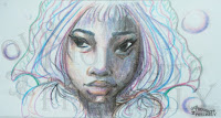
Honestly, this was probably one of the most frustrating experiences I’ve had with colored pencils in a very long time. As I was building the layers, I noticed that it was creating an effect that looked similar to cereal milk—specifically Lucky Charm cereal milk, after all the colors have bled off the marshmallows and mixed together. And the shadows weren’t where I wanted them to be. I resorted to using black to try and deepen the colors. One thing I noticed with the Fundamentals set is that once you have one layer of color down and you try to go over with another shade…yeah, don’t. By the time I actually reached the hair and the background stage, I actually thought about cheating and using the other Artist’s Loft set to try and fix the areas that were particularly egregious. But, I was committed to the process and decided to tough it out for the sake of this post.

Don’t get me wrong, the final image looks fine. I can achieve something with these pencils, but I, by far, prefer the Necessities set if I’m going to use Artist’s Loft colored pencils. In the end, theses are going to be reserved for paint use instead—they’re pretty light and don’t show through as much after additional color from another medium has been added on top.


But then, my co-blogger pointed out that the shadows aren’t as deep on the Necessities picture as the other two. For the sake of being impartial, I decided to go for a second round with the Necessities pencils to see how they worked on a picture with sharper shadows. But, that’ll have to wait for the second part, because this post is long enough as it is. So, part 2 will have more art, some swatches, and my final thoughts about these pencils.

Do you regularly use colored pencils? What’s your favorite brand?


Wednesday, October 31, 2018

The Spider Bride...

It’s finally October 31st. So, to start off this post I just have to say Happy Halloween! I actually planned ahead for once, and as such, had this post in mind as far back as the middle of September. And today, I’m finally going to talk about the second October related watercolor project I tackled: the Spider Bride. This is the other painting that I mentioned briefly on my Watercolor post for the witch redo. And I’m so excited to finally talk about this one. There’s no history behind this piece, and it came about kind of spontaneously.
The Process...
Around the time I was working on the witch painting, I did a quick sketch of another idea that I got out of the blue. I didn’t put too much effort into it, because at the time, I was just trying to parse out a general idea of it before I forgot. And ultimately, it didn’t fit with what I was trying to do with the Witch. So the idea landed on a different page, and that’s where it stayed until I decided that I also wanted to paint it. The Spider Bride is one of those sketches that happened to be good to go without too many alterations from the original version. Off to the side of the initial sketch, I played around with the option of doing a gothic cathedral inspired background. However, I ultimately abandoned that idea early on, because I didn’t like how it even appeared alongside the initial sketch for the Spider Bride.
When I mentioned on the Witch post that the color combinations for both paintings complimented each other, I honestly wasn’t kidding. I don’t know why, but I just didn’t go very dark with my color scheme. And the same thing applies for the Spider Bride. Once I started painting, my original warm/dark tones were tossed out the window in favor of the cooler tones I’m currently a fan of.

The final painting…


A couple of close ups...


The Witch and the Spider Bride side by side. From this view, it’s easier to see how the colors complement each other...


So, that’s about it for today. As for my next art related post, I’m planning to share some of the pages from my current sketchbook; although, I don’t know when that’ll appear on the blog—because I want to amass more pages so it’s not a post with one or two things. Anyway, I hope everyone has a great Halloween!


 Supply List...

Sakura Koi Watercolors
Prismacolor Premier Colored Pencils
Artist Loft Level 2 140lb watercolor paper
Gelly Roll white gel pen


Related Posts Plugin for WordPress, Blogger...